Padua Recommend
Redesigning a Fintech Strategy Tool for Financial Advisers
Padua's Recommend software lets financial advisers map strategy recommendations across 850+ technical strategies for their clients. The existing product was fragmented, glitchy, and forced paraplanners to do significant manual work outside the system. I joined a team of two UX designers to rebuild the experience, conducting user research, creating a service blueprint, facilitating a stakeholder alignment workshop, and designing three key screens that shipped into production.
Role
UX Designer
team
Head of Design
Head of Advice
UX Designer
Devloper
Tools
Figma
Miro
Axure
status
Core screens shipped; product in ongoing development
Recommend sits within Padua's broader software suite alongside Discover, Compare, and Padua Home. Together these tools support financial advisers and paraplanners through the full advice process, from client fact-finding through to strategy recommendations and statement of advice (SOA) production.
The existing version of Recommend had been built over time without a cohesive design foundation. It pulled users across different parts of the product without a clear flow, had reliability issues, and critically, offered no way to carry information automatically into the SOA. Paraplanners had to manually re-enter data the software already held, and had to chase advisers for sign-off through separate communication channels entirely.
For a product whose entire purpose was to make the advice process more efficient, it was creating more work, not less.
The problems came from multiple directions.
For paraplanners: After an adviser completed their strategy recommendations, the paraplanner had to manually write them up and send them to the adviser for confirmation, outside of Recommend entirely. This added unnecessary steps to every single SOA. Separately, advisers were uploading excessive documents with no structure, leaving paraplanners to manually check each one for compliance.
For advisers: The strategy selection experience was disorganised. With 850+ strategies available, there was no clear way to see what had been selected across multiple clients or entities, or to get an at-a-glance overview of the recommendation before moving into detail.
For the team: Stakeholders had different understandings of what each screen in the flow should do, what should be included, and in what order. Without shared alignment, design decisions kept getting revisited.
The core challenge was designing a clearer, more connected flow, while working in a genuinely ambiguous environment where the product scope was still being negotiated.

User Research
Because access to financial advisers was restricted, I interviewed 5 staff, including Paraplanners, Quality Assurance Managers and sales members, the people closest to the day-to-day pain in the existing product.
What came through clearly:
The confirmation step was the biggest friction point. Paraplanners were acting as messengers between the software and the adviser, manually writing up recommendations and waiting for sign-off through a separate system.
A visual overview of strategies across all client entities before entering detail would significantly reduce errors and back-and-forth.
Document uploads were unmanaged, no structure, no required fields, no limits, which created compliance risk and extra checking work for every SOA.
Working within the constraint of no direct adviser access meant going deep with paraplanners, who understood the adviser workflow intimately from the other side. Their perspective shaped every design decision that followed.

Service Blueprint
I created a service blueprint mapping the full Recommend flow across six phases: Strategy Map, Strategy Detail, Product Detail, Advice Costs, Model, and Confirmation.
The blueprint made visible what was unclear or missing at each stage, user actions, front-stage interactions, back-stage system actions, and supporting integrations with other Padua products. Critically, the Model phase had no defined content at all. The blueprint made this gap impossible to ignore and gave the team a shared reference point for what still needed to be resolved.

Stakeholder Alignment Workshop
Design decisions kept stalling because the head of design, head of technical advice, and the development team had different assumptions about what each screen needed to do. Rather than continuing to resolve this one conversation at a time, I ran a workshop bringing all three together.
The goal was to get everyone to map out what they believed each screen's purpose was, what it must include, and why. Seeing the differences side by side moved the conversation from competing opinions to concrete decisions. Running this workshop wasn't a soft-skills add-on, it was what unblocked the work.
Strategy Mapper
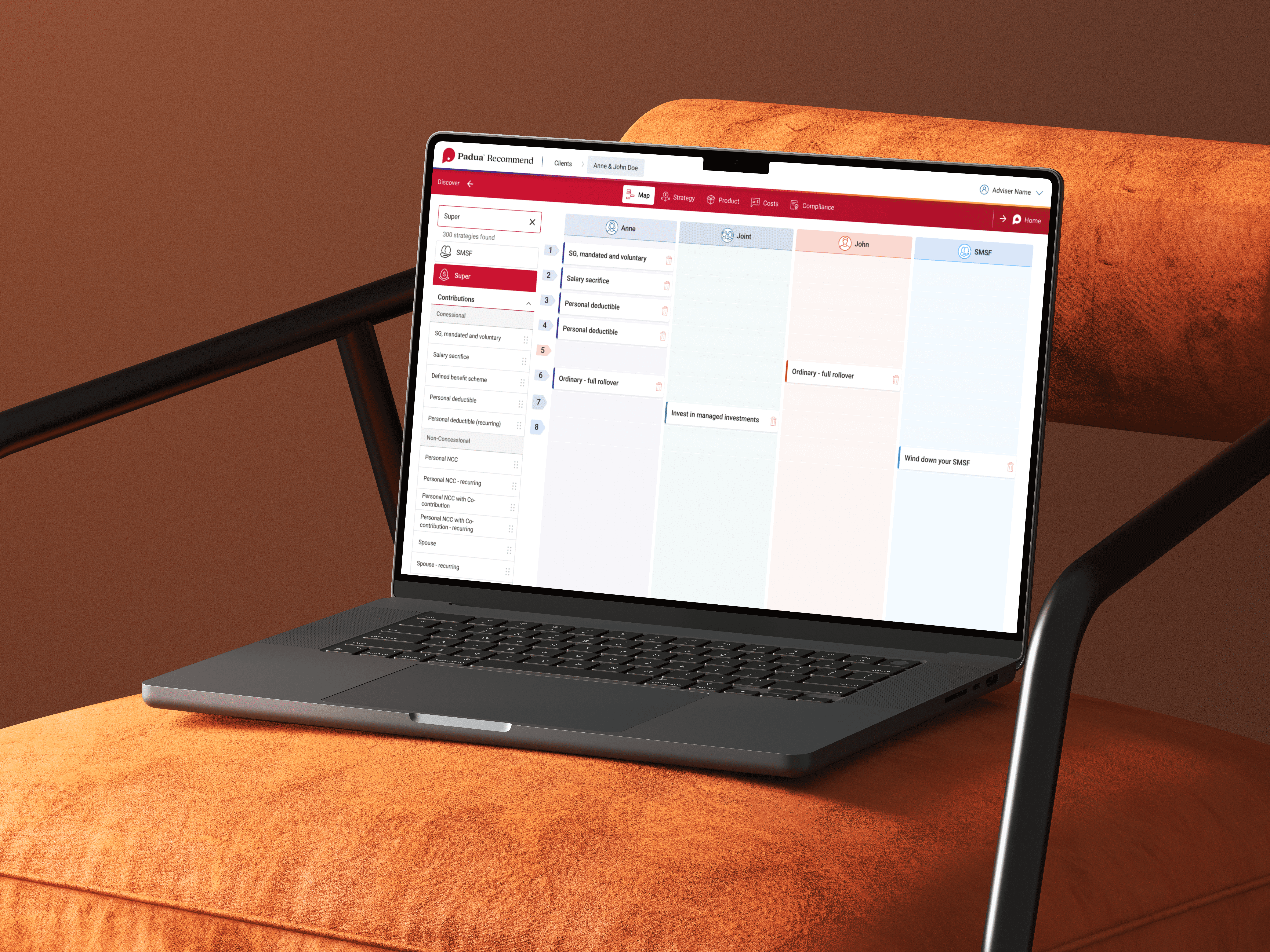
The strategy mapper needed to give advisers a clear visual overview of all recommended strategies before entering detail. The old experience had no such view, you were in the detail immediately, with no sense of the whole picture.
The solution was a column-per-entity layout (Anne, Joint, John, SMSF) with a searchable strategy library on the left. Advisers drag strategies into the relevant client column and order them by priority. With 300+ strategies filterable by category, the structure meant advisers could move quickly without losing track of what they had selected. The overview stayed visible throughout, so the adviser could see the full shape of the recommendation before committing to any detail.

Advice Costs
Previously, fee information was captured in simplified form fields buried within another screen. Moving it into a dedicated Costs step, with separate sections for initial fees, ongoing fees, commissions, and disclosures, gave it the structure the data actually required and removed the need to re-enter it elsewhere in the SOA process. The design supported both dollar and percentage fee types, GST inclusion, and per-entity fee attribution, handling the real complexity of advice fee structures without overwhelming the interface.

Confirmation Screen
The confirmation screen addressed the single most time-consuming manual workaround in the existing process. By bringing the sign-off step into Recommend itself, advisers could review and confirm strategy recommendations directly in the product, no separate write-up, no chasing confirmation through other channels.
I explored two approaches to this screen. The first focused on document upload, with required document categories, per-file tagging by client and strategy, and upload status indicators, so only relevant, properly categorised documents could be submitted. The second focused on objectives linking -- connecting each recommended strategy back to the client's stated goals and allowing alternative strategies to be recorded alongside the primary recommendation. Both addressed compliance requirements from different angles, and together they formed the foundation of the final confirmation flow.


The strategy mapper and advice costs screens shipped into production. The confirmation screen was in active development at the time I finished at Padua.
The business impact was reported publicly in Financial Newswire in August 2024, cited by Padua's Co-CEO Matt Esler. In Q1 2024, advisers recommended 141 strategies through Recommend - 16% of all available. By Q2 2024, that had grown to 247 strategies - 28% of all available. A 75% increase quarter on quarter.
Esler attributed this directly to the product: advisers with access to better advice technology felt empowered to recommend more strategies, increasing the value of the advice they were delivering to clients.
For paraplanners, the shipped screens reduced manual data entry in SOA production, removing steps that had previously required re-entering information the system already held.
Source: "Given the tools, advisers recommend more diverse strategies" -- Financial Newswire, August 26, 2024