Padua Solutions
The Website Rebuild That Cut Bounce Rates by 46%
Padua had a website that wasn't converting. Bounce rate was at 85% and the information architecture didn't reflect how different user types, advisers, paraplanners, and licensees, actually thought about the product. I led the end-to-end redesign and rebuild in Webflow, restructuring navigation around two distinct user types rather than product categories. Within 12 months, bounce rates dropped from 85% to 46%, sessions increased by 66%, and the sales team finally had a reliable resource that answered clients' questions.

Role
Lead UX Designer
Webflow Developer
team
UX Designer
Sales Team
Tools
Webflow
Figma
Hotjar
Timeline
4 months
The company was a financial technology platform serving two distinct audiences: financial advisers and licensee groups who needed software to run their businesses, and product providers who wanted to sell their products through the platform. Despite having strong software and services, their website failed to communicate this clearly.
The existing site had been built by a developer who'd left the company, making it technically impossible to update. This created a cascading problem: when the website couldn't answer basic questions about what the company did, the marketing team had to create supplementary brochures, and the sales team spent valuable time explaining fundamentals that a good website should have covered.
Key constraint: I had to learn Webflow from scratch while building the site, but I chose it strategically so anyone on the tech team could maintain it going forward.
The numbers told a stark story: 85% bounce rate, with average session duration of just 2 minutes and only 3,000 sessions over 12 months. Users were arriving and leaving almost immediately.
But the numbers only confirmed what we were hearing from multiple sources:
From the sales team: They were spending the first 5 minutes of every call explaining what the company actually did, time that should have been spent selling. Prospects would say things like "I looked at your website but I'm still not sure how you can help me."
From Hotjar analytics: Heatmaps showed visitors clicking around aimlessly, unable to find clear navigation paths. They'd land on a page, scroll partway through dense, jargon-filled content, and leave.
From the marketing team: They were constantly creating new brochures because different prospects needed different information, and the website wasn't providing it. This meant inconsistent messaging and wasted effort.
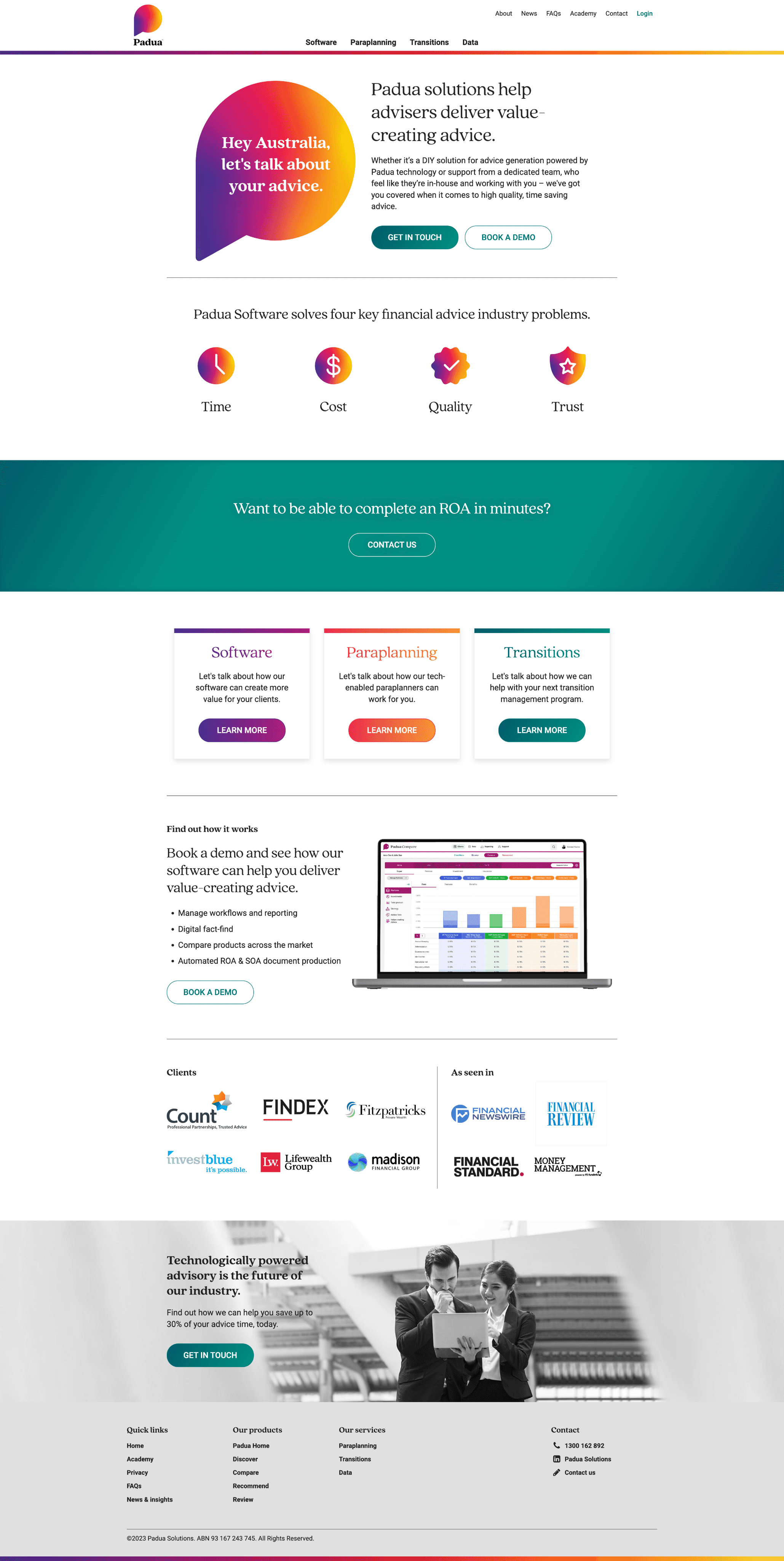
I conducted a content audit and found the core issue: the site was organized around internal product categories (Software vs. Paraplanning) and written with buzzwords like "comprehensive solutions" and "innovative platforms" without ever clearly explaining what the company actually did or who it was for.
The real problem: Two completely different user types were trying to use the same confusing navigation to find completely different information.

Research & Discovery
I started by talking to the people who heard customer feedback daily: the sales team and the key accounts team who managed client onboarding.
From 7 user interviews (practice managers, paraplanners, sales people, and three industry outsiders), I learned:
Financial advisers and licensees wanted to know: "What software features will help me run my business more efficiently?"
Product providers wanted to know: "How can I get my products in front of advisers through your platform?"
These weren't just different questions, they required completely different navigation paths and content.
I also conducted a competitor analysis and found an interesting pattern: competitors made it very obvious which pages to navigate to based on user type (good), but then overwhelmed users with too much content on those pages (bad). I needed to combine the clarity of user-type navigation with digestible content.
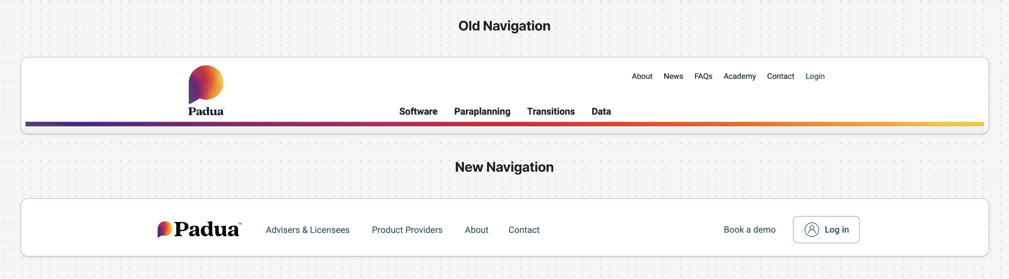
The Navigation Decision That Changed Everything
The biggest decision I made was to completely restructure the information architecture.
Instead of:
"Software"
"Paraplanning"
"Transitions"
"Data"
I proposed:
"For Advisers & Licensees" (showing relevant software AND services)
"For Product Providers" (showing relevant software AND services)
This was a hard sell to stakeholders. Some team members worried about duplicating content or maintenance complexity.
I ran usability tests with the navigation prototypes and showed them that users completed tasks significantly faster when they could self-select their path based on who they were, rather than guessing whether they needed "software" or "services."
Design Decisions
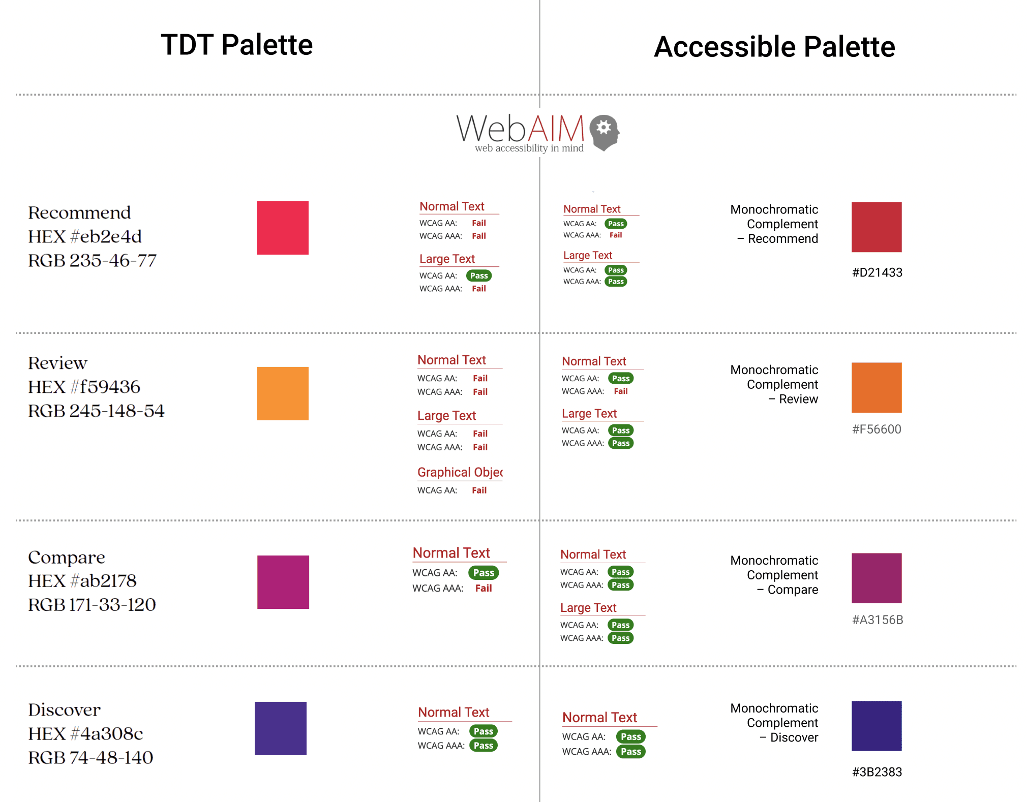
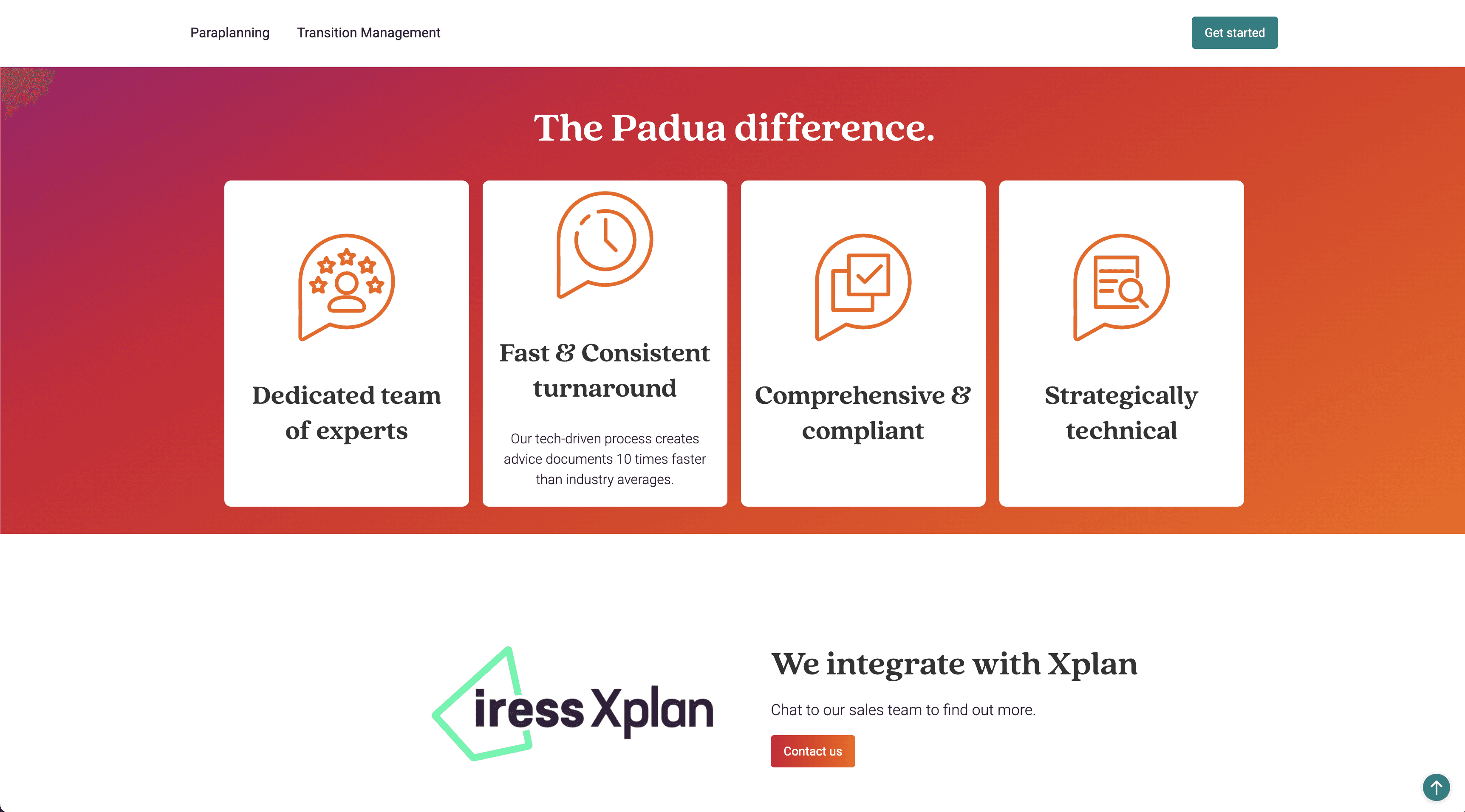
Visual hierarchy: I used the company's existing brand colours and gradients throughout, but adjusted some for accessibility.
Content strategy: I worked with the sales team to translate their verbal pitches into website copy. Every piece of jargon got replaced with clear explanation. "Comprehensive solutions" became "Software that automates your compliance reporting and client communications."
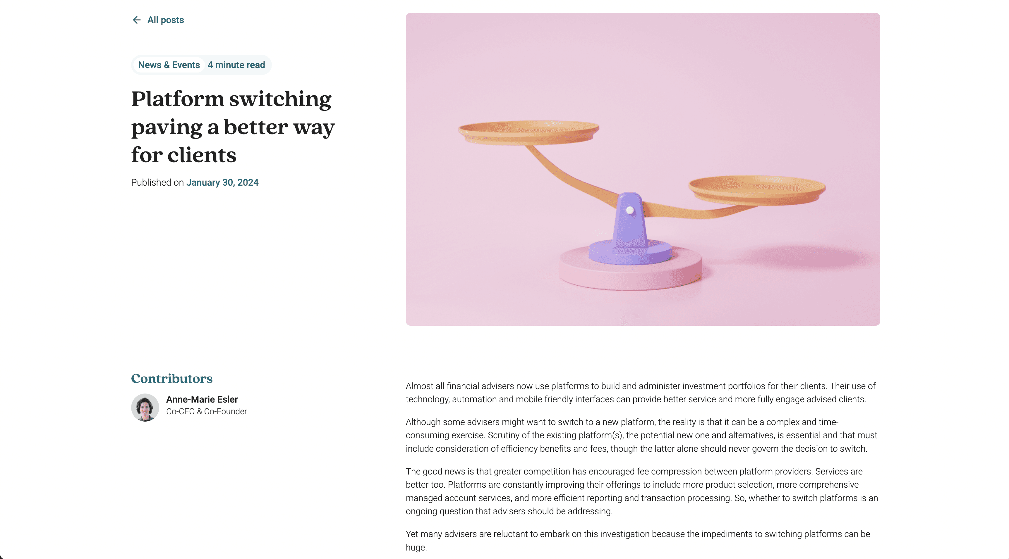
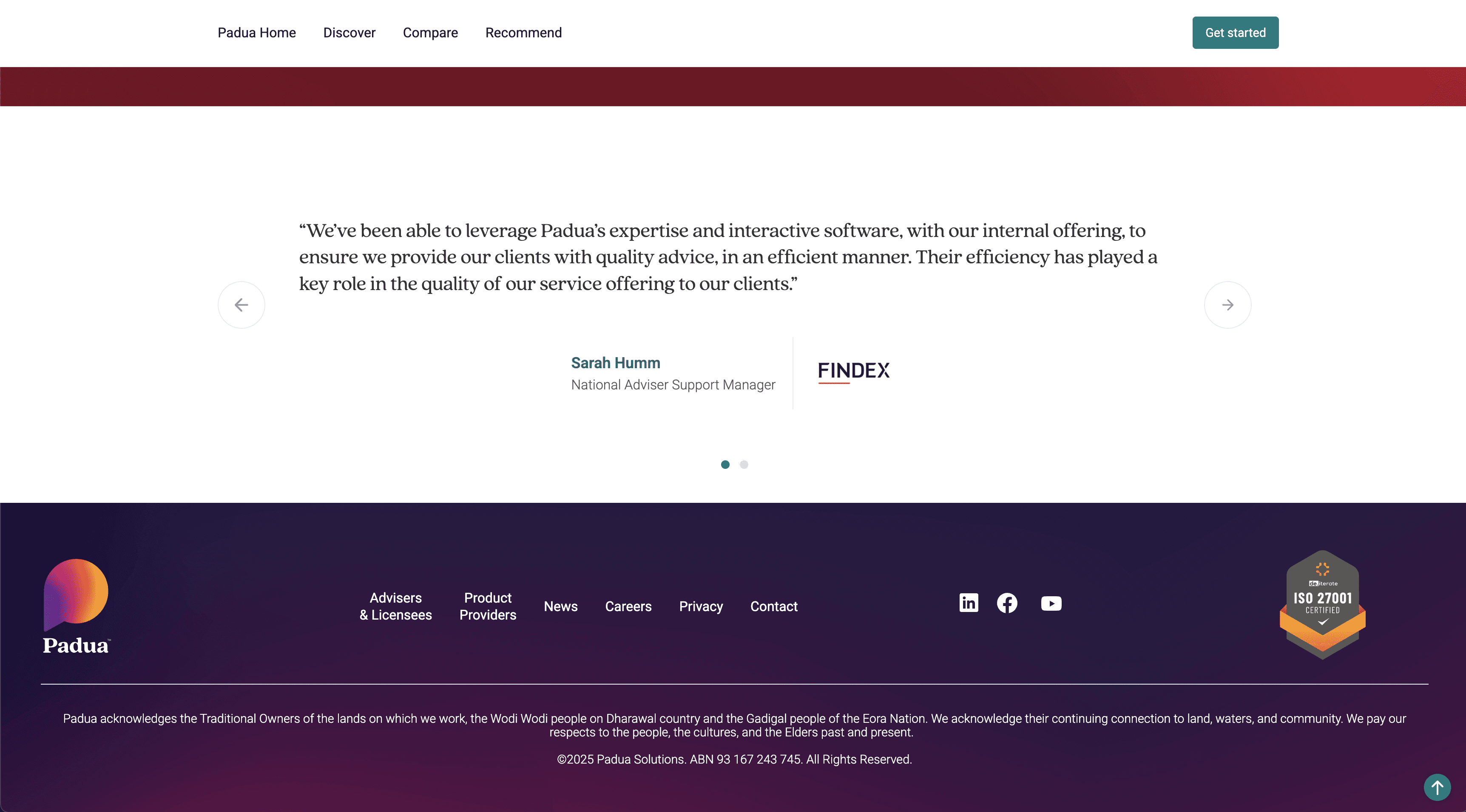
Human element: The company had a strong culture around family and relationships, but you'd never know it from the old website, no photos, no personality. I prioritized the About and Team pages, including photos of staff and the story behind the company.
Navigation: After multiple iterations, I added a persistent contact button based on user testing, some users just wanted to reach out immediately.
Choosing Webflow for Speed & Sustainability
I selected Webflow for this project because it would allow rapid iteration during the design phase and easy maintenance after launch. The platform's visual development environment meant I could implement responsive design quickly and make real-time updates as stakeholder feedback came in, no waiting on developer sprints.
Most importantly, it ensured the tech team could maintain and update the site independently without specialized developer skills, making the solution sustainable long-term.
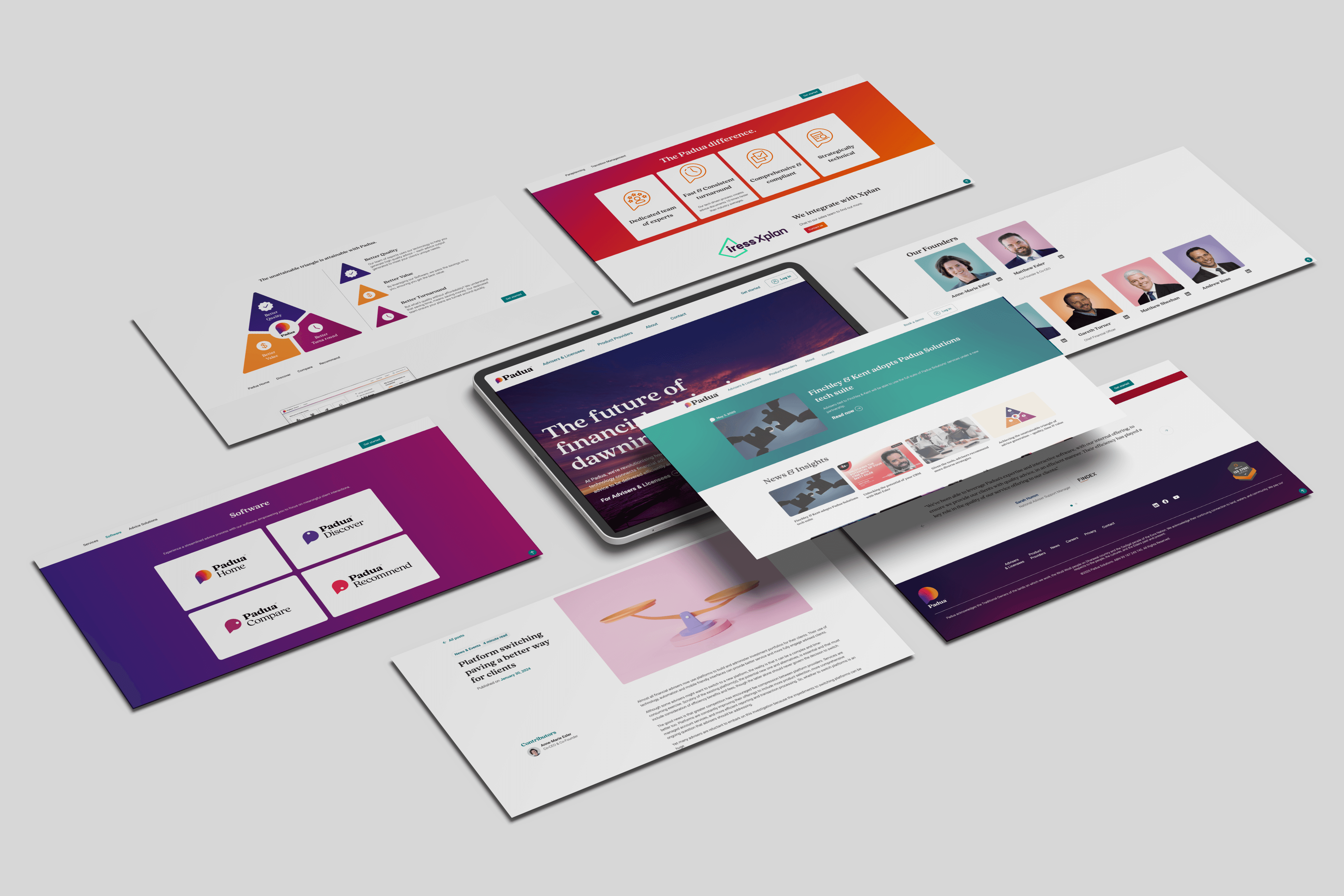
The final website centered on clear user pathways:
Homepage: Clean, modern design that immediately asked visitors "Are you an adviser, a licensee, or a product provider?" with clear visual cards guiding them to relevant sections.
User-specific pages: Each audience got dedicated pages showing exactly which software features and service offerings applied to them, no more guessing, no more irrelevant information.
Simplified content: Every page answered specific questions the sales and accounts teams told me were most common. Dense paragraphs became scannable sections with supportive images of the actual software.
Brand expression: Gradients and brand colours throughout, team photos, and a visual identity that finally matched the modern software the company was selling.
Always-visible contact: Persistent contact button and multiple conversion points throughout the user journey.


The Qualitative Wins:
From the sales team: "We're finally sending people to the website with confidence. Prospects come to calls actually understanding what we do."
From the marketing team: They stopped creating multiple brochures, the website became the single source of truth.
From stakeholders: Everyone was pleased that the site now aligned with the brand and accurately represented what the company had become.
What I learned:
Stakeholder management is design work. Some of my biggest challenges weren't technical—they were navigating strong opinions about the navigation structure. I learned to use user testing data and examples from other projects to build consensus rather than just advocating for my preferences.
Cross-functional collaboration is essential. The sales and key accounts teams weren't just feedback sources, they were co-designers. Their daily conversations with clients revealed insights I never would have found through analytics alone.
Sometimes you have to rebuild from scratch. I initially tried to salvage parts of the old site, but the technical debt and poor foundation meant a complete rebuild was actually faster and better. Knowing when to start fresh is a valuable skill.
The right tool matters as much as the design. Choosing Webflow wasn't just about what I could build, it was about what the team could maintain. A beautiful site that no one can update is a failure waiting to happen.